Us runners are a particular breed. We’ll drive hours, run for 2 or more hours, and drive right back (if our legs still work). Using data from the Rock the Parkway half marathon this spring, I was curious if there was a correlation between how far one drove/flew to complete and how fast they ran their race. My intuition was that if someone were to travel, say, 500 miles to run a race, this would indicate that they were a more “serious” runner than someone who just climbed out of bed and traveled across town.
Well, unfortunately, my hypothesis didn’t hold. But, I wanted to share my data journey, anyway.
To gather the data I needed (latitude, longitude, and distance from race site), I started with all the runners who ran the Rock the Parkway half marathon this year, then used the handy geopy package in Python to gather additional geospacial data. Once I had my dataset ready, I then tried a few different clustering approaches in R. However, even though I normalized the distances and run times, the various clusters were determined just by the distance in mileage. (I probably should pick up an R book on spacial analysis. I’ve actually heard this book is pretty good – perhaps this will be my motivation to pick it up.)
Here’s what the raw race time vs distance traveled scatterplot looks like:
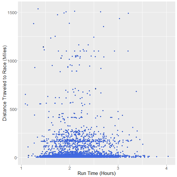
As you can see, there is no (visable) trend towards shorter run-timmes, based on how far someone traveled. Which, I guess makes sense – the majority of people who sign up for a half-marathon are going to take them serious, and put in the time to finish well, regardless of how far they live from the race site. At this point, I simply looked at the statistical correlation between run time and distanced traveled – 0.004 – which, point blank, indicates that there is NO correlation between run time and travel distance. Bummer.
Not wanting to waste my Python coding, I quickly transformed my data into a spacial scatterplot overlaid on top of a U.S. map. I used the R Leaflet package, which creates really high-quality javascript map plots. (My imagine will be static until I finally launch my personal Shiny server.) I should point out that I purposely chose NOT to use a choropleth map (shading geographic regions) as state-wide grouping would be too coarse, and county-level is (in my opinion) far too inconsistent in terms of boundary size. Therefore, I settled on just a scatterplot. (Perhaps I’ll update this post later with scatterplot smoothing/raster shading.)
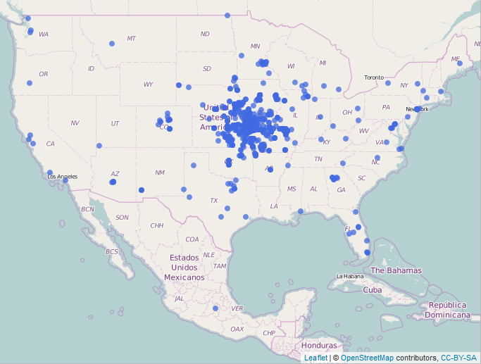
Notice the majority of instances clustered around the Kansas City metro; this comes as no surprise as the event was held in Kansas City, Missouri. The outliers here are more interesting; notice that a few people traveled from each coast, plus one from Mexico and another from Manitoba, Canada. 54% of runners of the Rock the Parkway race traveled less than 15 miles, and 76% of runners travled less than 40 miles, to run the race. My original hypothesis didn’t hold for the half marathon, but perhaps I’d see different results if I looked at a marathon or triathlon. (These events require much more training than a half marathon.)